Our Photography
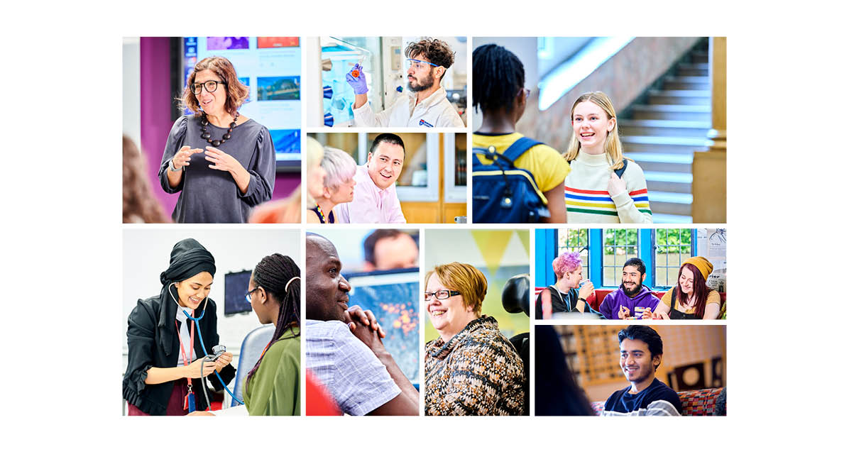
Photography should take our audience on a journey with us, help them understand who we are as an institution, and engage them to want to find out more.
Getting your selection right
We’ve all read a publication or looked at a website where the images didn’t look ‘right’. Perhaps the images weren’t relevant to the content or perhaps they didn’t give you the detail that you needed. In other cases, the photography might look outdated or stock images have obviously been used.
Selecting the right photos for the content that you’re creating is as important as getting the words right. It can help to think about the audience that your content is targeting.
- showing people in their natural/working environments will help the scene look ‘captured’ not contrived
- unless you’re capturing profile images, avoid photos of clearly posed people create a natural scene
- represent, promote, and celebrate the diversity of our community across our marketing materials.
- a closer crop on subjects as they interact with each other at key moments will ensure a natural style of photography
- choose a mix of images with some subjects looking away from camera and some into camera to add visual interest
- try to use interesting and relevant backgrounds and consider allowing room for a text box or graphic to be overlaid on the image (if required)

Location photography
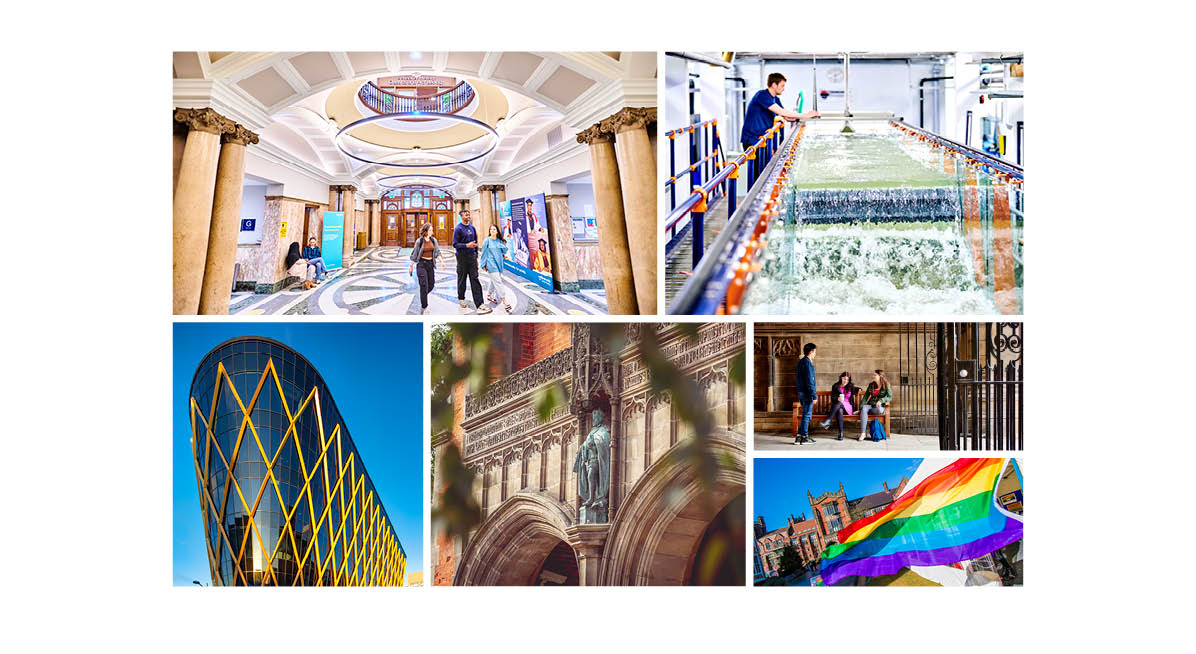
Imagery of our campus, buildings, and venues are also important for creating a sense of place. This is especially important for those who have never visited Newcastle before.
Our tips for effective location photography:
- capture places of particular significance and interest to create an inspiring sense of place
- consider the weather conditions, people, vehicles, and other possible variables when planning and executing your shoot
- show off a variety of locations in marketing materials where possible

Abstract photography
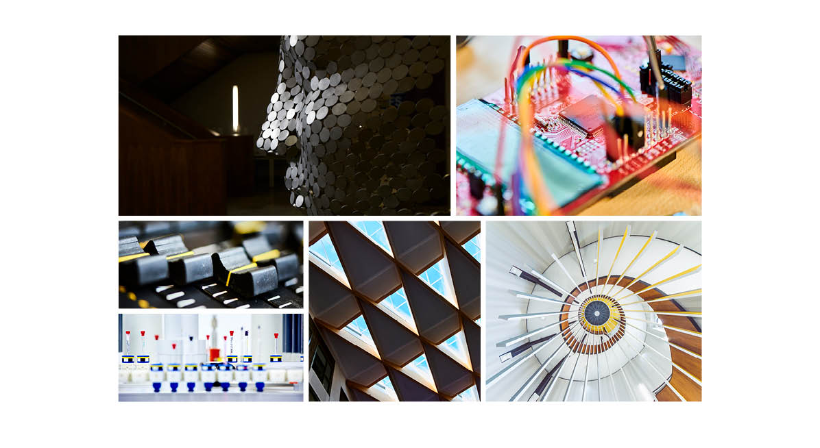
You can also use abstract shots of specialist equipment and signage to provide a greater variety of images, and to ensure a rich sense of place.

Mistakes to avoid
When planning a photoshoot, and when selecting images for use, there are a number of mistakes that should be avoided:
- photos where the subjects look disengaged
- photos that do not draw the eye with a particular focal point
- photos with dull lighting
- faces and expressions that are hidden or obscured
- using uninspiring shots of our buildings. We have some beautiful and impressive buildings, which we should show to their best advantage.
- cut outs of people, as these can appear contrived, and are often difficult to execute to a high enough quality
Arranging a photoshoot
There is a lot of imagery available in our Photo Library, however you may find that you need to organise your own photoshoot. For advice on photoshoots, contact the Brand Support team at brand-support@ncl.ac.uk. The following tips will also help:
- see our list of recommended photographers. Our Brand Support team can advise on who might be best for your project
- have a recce to the photoshoot venue in advance, even if it’s a venue that you are familiar with, to help the day itself go smoothly
- you should pay any students involved in photoshoots, which you can organise through Jobs On Campus
- when organising a shoot that involves students, all students must sign disclaimers
Image resolution and quality
It’s important to use high-quality images to achieve the best reproduction in both print and on screen.
For print
DPI is the number of dots in a printed inch and we recommend using images which have a resolution of 300dpi. The more dots, the higher the quality of the print, its sharpness and detail.
On screen
When it comes to displaying images on screen you need fewer dots or pixels than you do for printing. This is because the density of pixels on the screen is far less than that required for printing. We recommend that 150dpi is sufficient for digital use, and images should be a minimum of 800 x 800 pixels.