Readability (and Writing for the Web)
Extensive research carried out by usability experts over the past 25 years has determined how most people want to engage with web content. This quantitative and qualitative data informs best practice for writing for the web.
How people read on the web
Experts at Nielsen Norman Group have done a lot of research on user experience since the 1990s. Using eye-tracking technology in user testing, they discovered most people scan read web content (79% of users they tested in 1997).
They found that people used reading patterns in scan reading, including the:
- F-shaped pattern (most prevalent)
- layer-cake pattern
- spotted pattern
- commitment pattern
Research since has continued to show the same results. If anything, the level of scan reading has increased. As part of this research, Nielsen Norman Group determined solutions to help website users scan read content effectively.
Helping people engage with your web content
Research has found you can help people read your web content by using:
- highlighted keywords/phrases. Hyperlinks serve as one form of highlighting; bold is another
- meaningful sub-headings (not "clever" ones)
- bulleted lists
- one idea per paragraph. Users will skip over any extra ideas if they are not caught by the first few words in the paragraph
- the inverted pyramid style, starting with the conclusion
- half the word count (or less) than conventional writing
Keeping sentences short and active
To achieve the best results for scan readers, we need to keep sentences short and active. Applying the Flesch–Kincaid Grade Level Formula helps define how easy it is to read the content.
Generally, it prescribes that Plain English content should mean:
- sentences of no more than 20 words
- active rather than passive voice
- a readability score of 60+ out of 100 based on the formula
- a grade level of no greater than 9
Different grades for different audiences but similarities in presentation
Nielsen Norman Group's research helps us determine how easy it should be for our audiences to read our content.
- general - no greater than grade level 9
- expert - no greater than grade level 12 (this accepts a certain level of necessary jargon)
Find out more about Nielsen Norman Group's research into how to create great web content for expert audiences.
Scannable content
F-shaped pattern
Nielsen Norman Group's research identifies this as the most prevalent way that most people read web pages.
They read the headline and introduction and then look for visual cues on the left as they proceed down the page.
Catering your content to this behaviour allows users to get a summary of the page. They can then pick out pertinent bits for them.
F-shape pattern in practice
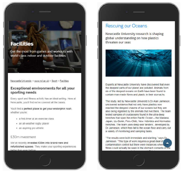
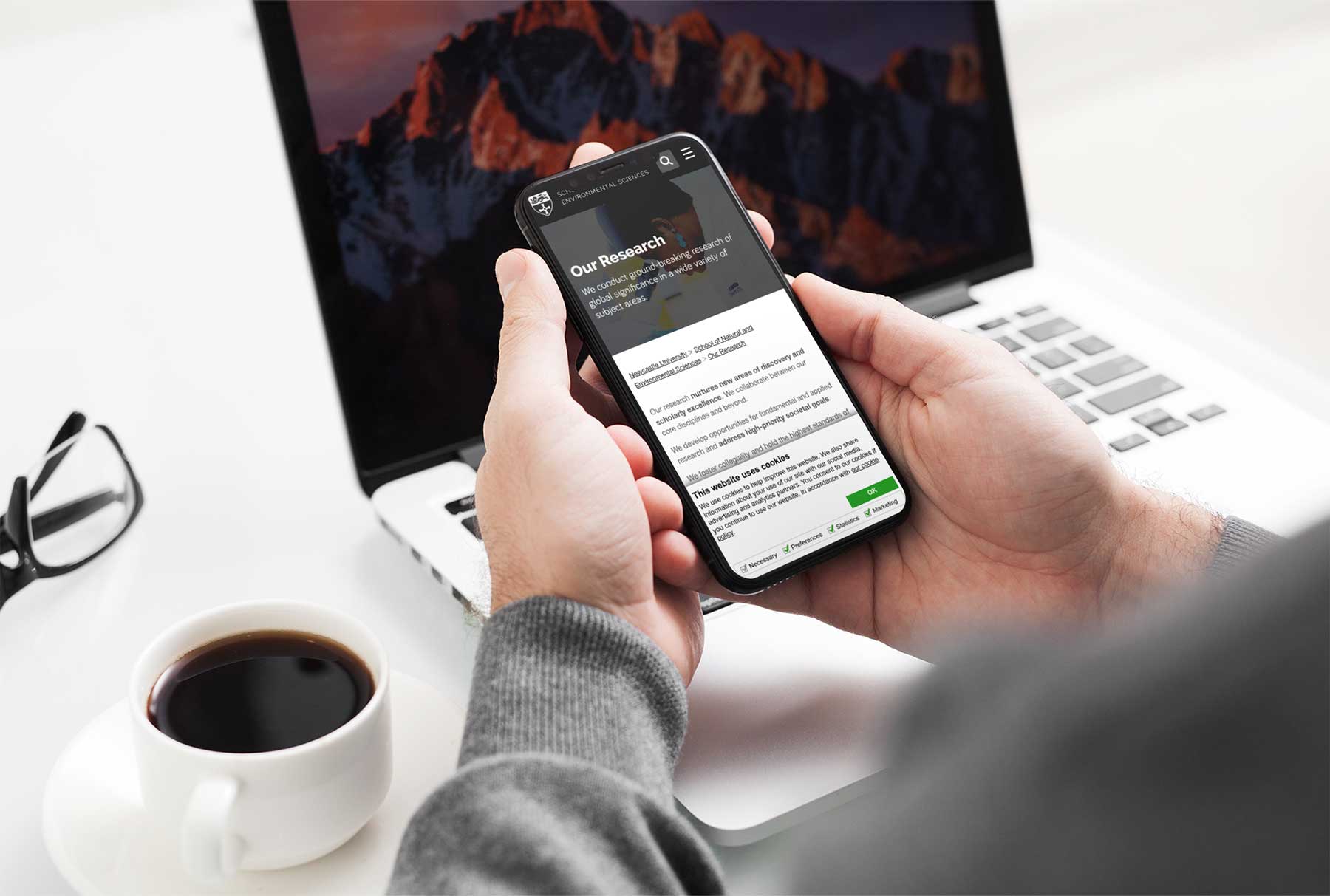
The example on the left of the image gives you:
- clear headings to allow users to pick and choose content to engage with
- bulleted lists to give users a quick and easy way to spot what's available
- summarises the content of the page using bold
- short sentences and white space to improve accessibility
Easy to pick out key points
It's easy to scan, with users able to pick out key points. It works with the F-shaped pattern, placing content where users should see it.
A 'wall of text'
The example on the right of the image gives you:
- few visual cues to scan the page

How do we test content on readability?
Here are a variety of tools available online to help. They allow us to test and edit content for readability and grade level.
The three that we've used are:
- Hemingway App, free web tool for editing and testing
- VT Writer, free web tool for editing and testing
- Silktide, University login for testing
