Displaying Data (Business)
Displaying data
When working in the financial industry you will be required to describe the data you are given to identify trends and make predictions. It is often easier to do this if your data is clearly displayed; this can be done via graphs such as histograms, box plots, stem and leaf diagrams, scatter plots and pie charts (all of which can be made using a computer software such as R, excel or Minitab).
Stem and Leaf Diagrams
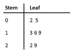
If we had data such as: $16,22,5,19,29,2,13$ we could display it in a stem and leaf plot to make it clearer. Firstly we would decide upon an interval width (e.g. go up in $10$s) This would give a stem unit of 10 and leaf unit of 1. The stem and leaf plot for the above data is:

|centre
Where $n = 8$ , stem unit = $10$, leaf unit = $1$
Note: If your sample size is large you can split each row up into two or more rows ( e.g. 10-14 and 15-19).
This method of displaying data spreads out the values in an organised way and so makes analysis easier.
Bar Charts
Bar charts display frequencies of qualitative data. When drawing these remember to leave clear gaps between the bars. Often bar charts are used to represent qualitative data such as ethnic diversity in a workplace. See also Bar Charts for a more detailed explanation.
Histograms
Histograms are similar to bar charts but are used for quantitative data and no gaps may be left between the bars. The data must be split up into segments (class intervals). Histograms can be used to represent datasets of measurements of height or weight for example. Note: The frequency of each interval (e.g. with a height between 100cm and 120cm) is the amount of data values in that interval. The relative frequency of an interval is the proportion of values which lie in that interval and is calculated by dividing the frequency of one interval by the total number of data values.
For a more detailed description see Histograms.
Scatter Graphs
A scatter graph is used to compare two sets of data which you think might be correlated. An example in business is a company's annual profits over the last 5 years and its annual costs in the last 5 years. To compare these datasets, we would plot, for each year, the annual costs on the $x$-axis and the annual profit on the $y$-axis (or the annual costs on the $y$-axis and the annual profit on the $x$-axis). We are essentially “pairing” the two datasets (costs and profit) for each year and plotting the corresponding coordinates. For more information on correlation and regression see Regression and Correlation.
For further information on scatter graphs in general see scatter graphs.
Pie Charts
A pie chart is a circle in which “pie slices” represent the relative sizes of each “class” of data.
Note: the sum of the segments must mean something significant e.g. the total spend on all raw materials purchased in a year.
For further information see pie charts.
Worked Example 1
Worked Example
Draw a histogram to represent the data on the number of telephone sales made by the company called Kiwi per day. No. of telephone sales: $ 0, 0,1,2,2,3, 4,4,4,4,4,5,6,6,6,7,7, 8,8,8,8,9,9,9,10,10,10,11,11,11, 12,13,14,14,15.$

Solution
First split that data into appropriate intervals. It is often easier to work with the data if you put it into a table:
|
Class |
Frequency |
Relative Frequency |
|---|---|---|
|
$0-3$ |
$6$ |
$\dfrac{6}{35}$ |
|
$4-7$ |
$11$ |
$\dfrac{11}{35}$ |
|
$8-11$ |
$13$ |
$\dfrac{13}{35}$ |
|
$12-15$ |
$5$ |
$\dfrac{5}{35}$ |
|
Total |
$35$ |
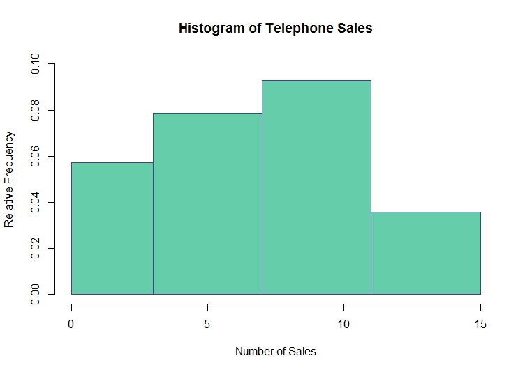
We can see that there are $35$ data values which have been split into 4 class intervals. The relative frequency of each class is therefore the frequency for the interval divided by $35$. The histogram below has been produced in R (but could also have been created in Minitab). On the $y$-axis we have the relative frequency of each class interval and along the $x$-axis we have the number of sales per day (in intervals) . We can see that the relative frequency of the $8-11$ class is the highest: the most common interval of sales per day is the 8-11 class. Similarly, the 12-15 interval is the least common.

| centre
Worked Example 2
Worked Example
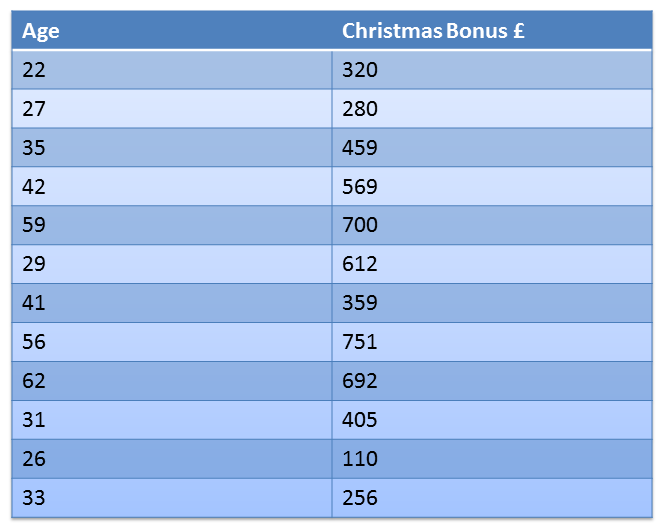
Create a scatter graph of the recorded annual Christmas bonuses of managers and their ages (see table below), comment on any patterns you notice. 
Solution
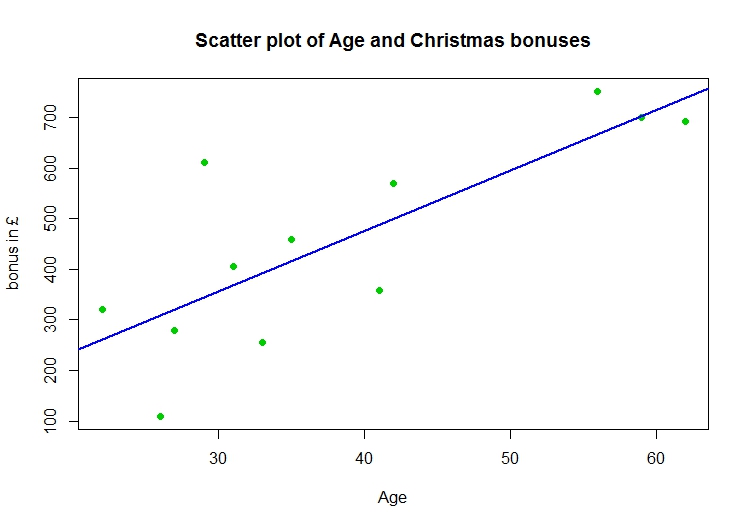
Firstly we input the data in R (or Minitab). We then create the scatterplot of the data with age on the $x$-axis and annual bonus (in $£$) on the $y$-axis and add the line of best fit. The result is displayed in the plot below:  The line of best fit suggests that there is a positive correlation between the two variables (a manager's age and the size of their Christmas bonus) as in general the amount of bonus received increases with age.
See Also
For more information on the topics covered in this section see descriptive statistics and presenting data. To develop these ideas further see hypothesis testing