Frequency Distribution Tables
Definition

|250px
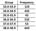
A frequency table is a way of summarising a set of data. It is shown by a set of frequencies with a set of categories, intervals, or values into which a data set is classified. It can used to summarise qualitative or quantitative discrete data. It may also be used to summarise continuous data once the data set has been divided up into sensible groups.
In the simplest form, frequency distribution tables are a table with two columns, one labelled with the categories, intervals or values and the other with the corresponding frequencies.
Worked Example 1
Worked Example
The men's hockey team at the University of Birmingham participated in 14 games this academic year. The total goals scored per game were recorded throughout the season. Summarise the number of goals scored per game into a frequency distribution table. The results were as follows:
\[0, 3, 3, 3, 4, 0, 2, 4, 7, 2, 2, 3, 5, 3\text{.}\]
Solution
Start off by ordering the data values in ascending order. Next add up the total number of times the team scored each number of goals ranging from the minimum value, in this case $0$, up to the maximum value, in this case $7$. Plot the number of goals against frequency in a frequency table.
\[0, 3, 3, 3, 4, 0, 2, 4, 7, 2, 2, 3, 5, 3\text{.}\] \[0, 0, 2, 2, 2, 3, 3, 3, 3, 3, 4, 4, 5, 7\text{.}\]
|
Number of Goals |
Frequency |
|---|---|
|
$0$ |
$2$ |
|
$1$ |
$0$ |
|
$2$ |
$3$ |
|
$3$ |
$5$ |
|
$4$ |
$2$ |
|
$5$ |
$1$ |
|
$6$ |
$0$ |
|
$7$ |
$1$ |
Video Example
This is a video on how to create grouped frequency distribution tables produced by Alissa Grant-Walker.
Workbook
This workbook produced by HELM is a good revision aid, containing key points for revision and many worked examples.
- Descriptive statistics including work on frequency tables.
Test Yourself
Test yourself: Presenting data
External Resources
- Grouping data at BBC Bitesize