Readability
Good readability makes content easier for everyone to understand.
What is readability?
Readability is a measure of how easy a piece of content is to read. It encompasses the level of complexity of the content and its legibility, including both typography and layout. Readability is a key factor of user experience, in both digital and print content.
People read faster and retain more information when content is:
- organised
- coherent
- easy to understand
- well presented
Writing with readability in mind
When we write we should:
- use an active voice
- use sentence case (upper and lower case)
- avoid writing in all-caps. All-caps writing is harder to read due to the lack of ascenders and descenders and can appear ‘shouty’
We should also write with our audience in mind. That means writing in plain English, avoiding jargon, colloquialisms and clichés. We should use appropriate vocabulary.
Structure content, presenting information in a logical way to aid copy flow. Writing in short paragraphs makes content easier to read and understand.
We shouldn't only measure paragraphs by length. They should contain a key sentence or idea and relevant supporting sentences. They should also end with a closing or transition sentence moving the reader on to the next paragraph.
Introduce headings and subheadings to organise content into sections, making it scannable. Images and graphics break up text and make content more visually appealing.
Remember:
- be concise
- be accurate
- keep sentences to the point, removing unnecessary clauses
- avoid complicated punctuation
- proofread your copy, checking for grammatical errors, spelling and incorrect punctuation
- follow Newcastle University’s style guide
Helping people engage with your content
You can help people to read your content by using:
- highlighted keywords/phrases - this could be bold text, or hyperlinks for web content
- meaningful sub-headings (not 'clever' ones)
- bulleted lists
- one idea per paragraph. Users will skip over any extra ideas if they are not caught by the first few words in the paragraph
- the inverted pyramid style of writing, starting with the conclusion
- a reduced word count
Using Plain English
Writing in Plain English means writing content that is easy to understand. Written well, your content will be direct, but not simplistic, helping you to deliver your message quickly and effectively.
To achieve Plain English, content creators should:
- consider the audience
- use simple language that won't confuse the reader
- write in concise sentences of no more than 20 words
- use active rather than passive voice
- organise content logically to help the reader navigate the page
- define acronyms and abbreviations to give full context
Try to avoid unnecessary words and double negatives in sentences. We want efficient content that is straightforward.
Remember, brevity helps readability.
Keeping sentences short and active
To increase the readability of your content, you should keep sentences short and active.
You can use the principles of the Flesch–Kincaid Grade Level Formula to help determine how easy it is for a reader to engage with your content. This is a tool that assesses factors including the number of words and sentences, and the lengths of your words and sentences, to establish a reading grade level of your text.
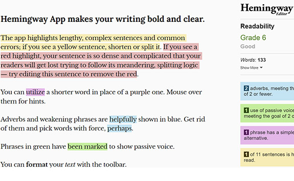
The Hemmingway App is an easy online tool which will help to grade your content.
Generally, it prescribes that Plain English content should mean:
- sentences of no more than 20 words
- an active rather than passive voice
- a readability score of 60+ out of 100 based on the formula
- a grade level of no greater than 9
Different grades for different audiences
Experts at Nielsen Norman Group have done a lot of research on user experience since the 1990s. Their research helps us determine how easy it should be for our audiences to read our content.
- General - no greater than grade level 9
- Expert - no greater than grade level 12 (appropriate for detailed research pages)
How people read on the web
Usability experts have determined how most people want to engage with web content. This quantitative and qualitative data, collected over 25 years, informs best practice for writing for the web.
Using eye-tracking technology in user testing, The Nielsen Norman Group discovered most people scan read web content (79% of users they tested in 1997).
They found that people used reading patterns in scan reading, including the:
- F-shaped pattern (most prevalent)
- layer-cake pattern
- spotted pattern
- commitment pattern
Research since has continued to show the same results. If anything, the level of scan reading has increased. As part of this research, Nielsen Norman Group determined solutions to help website users scan read content effectively.
Users won’t read web content unless the text is clear, the words and sentences are simple, and the information is easy to understand.
Scannable web content
F-shaped pattern
Nielsen Norman Group's research identifies this as the most prevalent way that most people read web pages.
They read the headline and introduction and then look for visual cues on the left as they proceed down the page.
Catering your content to this behaviour allows users to get a summary of the page. They can then pick out pertinent bits for them.
Your content should have:
- clear headings to allow users to pick and choose content to engage with
- bulleted lists to give users a quick and easy way to spot what's available
- short sentences and white space to improve accessibility
Making print readable
In 2019, Newcastle University introduced the Derailed typeface for all printed materials. It is part of our visual identity and brings consistency to our printed content.
Installed on all Windows desktops across campus, Derailed is a sans serif type. Our visual identity guidelines outline seven different weights (plus italic versions) available to use across materials to allow flexibility, but create consistency.
When we talk about ‘typography’, this describes how we use Derailed, and also how the content is arranged. This also aids readability.
When using Derailed bear in mind:
Type size
The smaller the size of the text, the more challenging it can be to read.
Type weight
This refers to the thickness of a font, with the most common weights being regular and bold. Using bold for keywords or phrases adds emphasis; making entire sentences or paragraphs bold dilutes the impact.
Type style
The most common is italics. This style can be used in print, but if used excessively or at a small size it can be hard to read.
Line length and column width
Very long lines of text can be hard for the eye to follow; short lines of text can result in hyphenated words. Both reduce readability. Opinions vary on optimum line length, so a good rule of thumb is to test the column width yourself. If you’re struggling to read text over a single column, it’s probably too wide.
Line spacing (leading)
Tightly packed lines of text are hard to read. Similarly, increasing the leading between lines of text or paragraphs reduces readability. Derailed has a default setting for leading to ensure readability.
Paragraph alignment
Text can be aligned right, left, centred or justified. Justified text can produce uneven spaces between words and be harder to read. The varying line length of left-aligned text helps a reader keep track of where they are.
Underlining
This can obscure the descenders on letters, making the text less legible and the content appear cluttered. Reserve underlining for identifying hyperlinks.
Background colour and contrast
Make sure there is enough contrast between the text and its background so content is legible.
Useful web tool
Edit raw content or check existing content using Hemingway App.
This free web tool can help you optimise written web content with simple, colour-coded visual support. It can help you:
- optimise sentence length
- eliminate passive voice
- remove unnecessary jargon and words
- achieve the grade level for audiences
- use bullet points instead of listing in sentences
Get rid of half the words on each page, then get rid of half of what’s left.