Our Colour Palette
Our brand colours are a key part of expressing who we are, as one cohesive and consistent University community.
A simplified and consistent colour palette
As we move forward, we are going back to our roots.
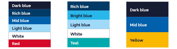
The University’s streamlined colour palette consists of a range of blues, with accent colours including red, yellow, and teal.
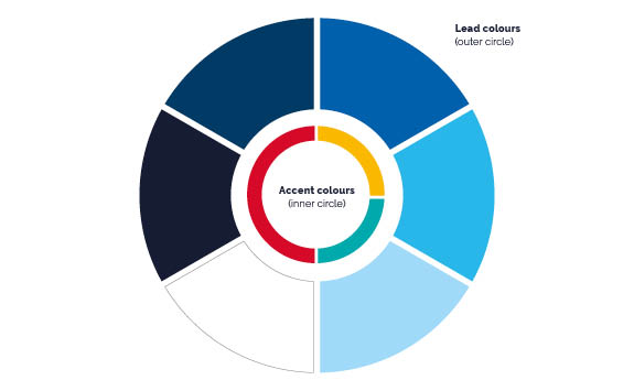
You should use at least one of the primary colours as the lead, or ‘main’ colour. Accent colours should only be used as a small proportion of the overall design and never used as a dominant colour.
Colour wheel
The colour wheel articulates how we will use the colours proportionally.
Black and grey are not part of our University’s colour palette. You should only use them for body copy across our materials.
Colour values
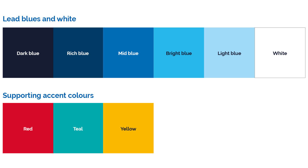
Lead blues and white
Dark blue
Pantone: 2768
CMYK:100 / 90 / 45 / 60
RGB: 5 / 20 / 53
#051435
Rich blue
Pantone: 541
CMYK:100 / 58 / 9 / 50
RGB: 0 / 58 / 101
#003a65
Mid blue
Pantone: 2727
CMYK: 95 / 50 / 0 / 0
RGB: 0 / 115 / 188
#0073bc
Bright blue
Pantone: 2915
CMYK:67 / 7 / 0 / 0
RGB: 41 / 183 / 234
#29b7ea
Light blue
Pantone: 290
CMYK: 40 / 0 / 0 / 0
RGB: 142 / 216 / 248
#8ed8f8
White
Pantone: White
CMYK:0 / 0 / 0 / 0
RGB: 255 / 255 / 255
#fffffff
Supporting accent colours
Red
Pantone: 186
CMYK: 2 / 100 / 82 / 6
RGB: 198 / 12 / 48
#da1a35
Teal
Pantone: 326
CMYK: 84 / 0 / 38 / 0
RGB: 0 / 163 / 155
#00a39b
Yellow
Pantone: 124
CMYK: 0 / 31 / 100 / 0
RGB: 253 / 200 / 47
#fdc82f
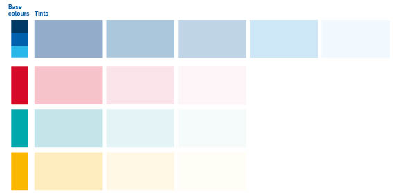
Tints
We've selected a range of tints to support our core colour palette. These are particularly useful for tables and charts. They shouldn’t be used as a core colour of your design.
Our tints should be generated from the colour values listed in our visual identity guidelines and not by creating a percentage tint of our base colours.
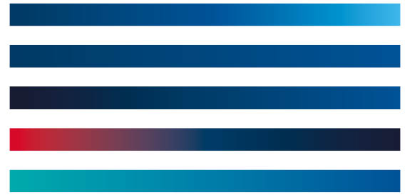
Gradients
Gradients of the brand colours can be used to add depth and movement to designs.
We have created a specified set of gradients and related colour values to create gradients within University designs.
It is important to stick to these gradients for consistency across our materials. Don't create your own gradients outside of these combinations to ensure both accessibility and brand consistency.
You can apply gradients in a range of directions and you can use these across both print and digital.
Download our visual identity guidelines for full details and values needed to create our brand gradients.
Digital colour palette
Colours can perform differently when used digitally in comparison to print. To ensure digital accessibility, our brand colour palette has been assessed for online and screen usage.
The majority of our core colour palette remains consistent across our print and digital material, with the exception of our teal accent colour. For our digital colour palette we have both a paler and a darker teal that you can use.
These have different HEX codes to the core colour palette, and have been chosen for their contrast ratios, so that they stand out on screen.
Darker teal: #00857e
Brighter teal: #00dbcf
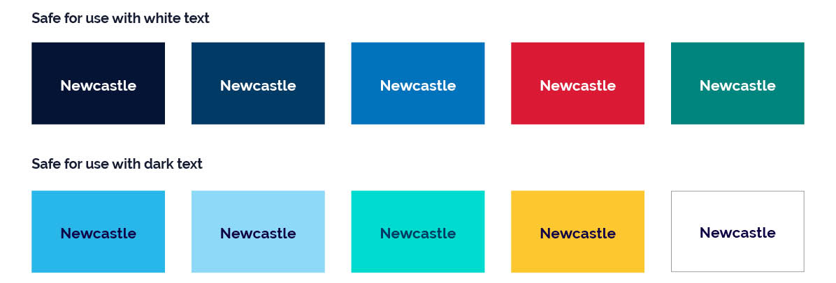
It is important to understand accessibility when creating digital designs using our colour palette. A key part of this is ensuring adequate contrast when using blocks of colour and text on coloured backgrounds.
Examples have been given to illustrate which background colours are more compatible with white or dark text.
Download our visual identity guidelines for full details and values needed to use our colour palette digitally.
For more in depth guidance please see the Newcastle University Digital Design System.
Colour combinations
Consideration of how our brand colours work alongside each other is key. Some combinations are much more effective than others.
Different combinations of these colours and their tints can dramatically change the tone and appearance of your materials, so always consider your audience and purpose.
You must also consider accessibility. When overlaying text on a coloured background, always make sure there is sufficient contrast between the background and the text for legibility.
Things to consider:
- avoid insufficient contrast between light and dark colours in combination
- a mix of primary blues and white across materials is important to create depth across our brand
- use supporting accent colours sparingly