Our Graphics
Our brand includes some key graphics which help to express our identity, and keep our designs consistent and cohesive.
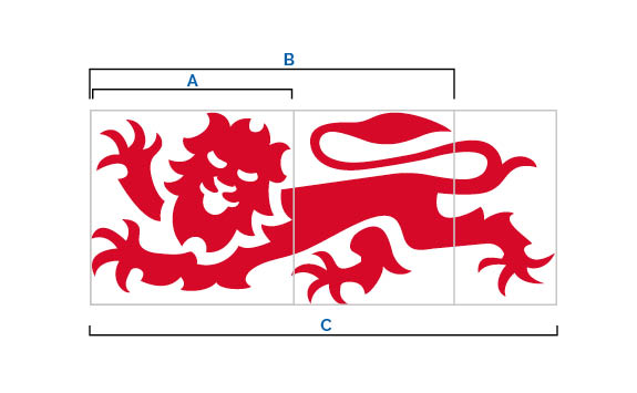
Our lion
Our lion motif is taken from our logo. It is central to our identity, and can be incorporated into our designs to reinforce our brand.
You can use the lion device in full, or in one of the three sections shown.
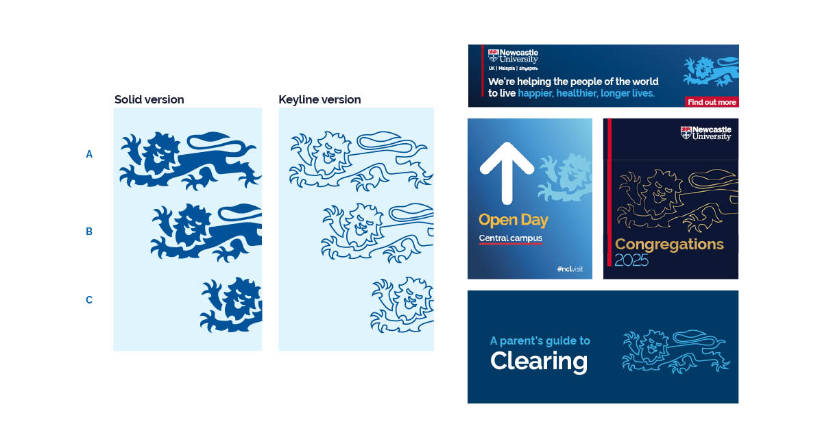
It is available as a solid image, or as a keyline version. You can download both from our Asset Library.
You can apply transparency when using the lion device to create a more subtle effect.
The bold line
Throughout our materials we use a bold line device. This introduces accent colour effectively and serves to anchor both text and images. This can be used in a variety of ways as indicated in the examples shown.
The width of the line should reflect the weight of the copy that it sits alongside.
Try to minimise the use of the bold line to maximise its impact. You should use this as a supporting device, and not the main feature of a design.
Refrain from using the bold line at any angles other than 0° and 90°. This will maintain clean, uncomplicated layouts.
The bold line is an effective way to integrate the logo red into a design as an accent colour, but equally can be one of the other accent colours, or blue.
You can also use a bold underline to help to highlight text. Please ensure that you place the bold line below the descenders from any copy above.
Support and advice
If you need any support and advice with brand designs and creative, please contact brand-support@ncl.ac.uk.